Quick Take
- Narration: Brian Arens delivers clean, professional narration that handles technical vocabulary well, though the PDF companion is essential for the visual content this book was built around.
- Themes: Data visualization best practices, business intelligence, chart design psychology
- Mood: Practical and grounded, with a patient instructional quality
- Verdict: A thorough reference for anyone building business dashboards, though the audio format works best as a companion to the included PDF rather than a standalone listening experience.
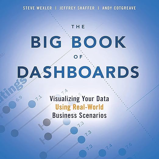
I came to The Big Book of Dashboards on a Tuesday afternoon when a client had just rejected a reporting mockup with the note “can you make it pop more?” If you’ve spent any time in data visualization work, you know exactly what that sentence costs you. I had heard the book referenced in analytics circles for years, always described as the reference work on the subject, and finally decided the audio version plus the included PDF was worth the investment.
What I found was something genuinely useful, though the format requires a deliberate approach from the listener. Steve Wexler and his co-authors have produced what amounts to a professional handbook organized around real business scenarios across healthcare, transportation, finance, HR, marketing, and sports. That scenario-driven structure is the book’s central strength: rather than organizing by chart type or theoretical principle, it asks what you’re actually trying to communicate, and then shows you how.
When the Visual Medium Meets the Audio Format
There’s an honest tension at the center of this audiobook that’s worth naming plainly. Dashboards are, by definition, visual artifacts. Wexler’s book contains dozens of actual dashboard examples, and the text frequently refers to specific design choices that are only visible in the accompanying PDF. Brian Arens narrates with clarity and professionalism, and his handling of terms like “packed bubbles,” “donut charts,” and “heat maps” never becomes awkward. But listeners who skip the PDF will hear descriptions of layouts they cannot see, which blunts the book’s most practical value.
The audiobook format works best for the sections dealing with organizational dynamics and the psychology of stakeholder management. The chapter on what to do when someone asks you to make a dashboard “cooler” is more useful as a listening experience than as a read, because Wexler’s voice through the narration carries the exasperation and professional weariness that will feel immediately familiar to anyone who has navigated those conversations. That empathy, as the authors describe it, is earned through decades of consulting work, and it comes through.
The Scenario Framework That Earns Its Depth
The book’s organizational logic holds up well in audio. Because each section anchors to a specific business scenario rather than an abstract principle, the listener can follow the argument without needing to see the accompanying visual. A healthcare administrator monitoring patient flow metrics and a financial analyst tracking quarterly variance against forecast face different communication challenges, and Wexler treats those differences as meaningful rather than cosmetic. The accumulated effect over nearly eight hours is a fairly comprehensive education in how dashboards actually fail in practice and what distinguishes the ones that get used from the ones that get ignored.
The coverage of psychological factors in visualization is where the book earns its reputation. The discussion of how viewers process information hierarchically, how color choices carry embedded meaning that varies across industries, and how dashboard complexity tends to inflate over time as stakeholders request additions rather than replacements, all of this holds up as both practical and well-reasoned. The 920 listeners who’ve given it a 4.6 average are, based on the review content, largely practitioners who are using it as an ongoing reference rather than a one-time read.
What the Print Reviews Reveal About the Audio
One reviewer, a CFO, notes explicitly that you don’t read this book, you reference it, and that observation matters for audio listeners. The audiobook format does not change that fundamental nature. What it offers is a chance to absorb the conceptual framework and the scenario vocabulary without sitting at a desk, while the PDF companion handles the visual specifics. Used in combination, during a morning commute with the PDF open for reference periods, the book works well. Treated as an independent audio experience, it will leave listeners with strong principles but an incomplete picture of how those principles manifest in specific designs.
Who This Reference Serves Best
The people who will get the most from this audio experience are practitioners who already have some visualization familiarity and want a principled framework for the design arguments they’re already having with stakeholders. David L.’s review focuses on its value for Tableau users specifically, but the book’s content is platform-agnostic in principle even if many examples lean toward Tableau implementations. New entrants to the field will find the conceptual grounding valuable but may struggle without being able to see the referenced examples.
Listen if you work in any function that produces dashboards for business decision-makers, and you want language and evidence for the design choices you’re already instinctively making. The companion PDF is not optional. Skip this one if you are looking for a purely audio-native learning experience or if you need hands-on technical instruction in a specific tool.
Frequently Asked Questions
Do I need to access the PDF companion to get value from the audiobook?
Yes, meaningfully so. The book is organized around visual dashboard examples, and Brian Arens’ narration frequently references specific layouts and design elements that are only present in the PDF. Audible includes the companion PDF in your library when you purchase. Listening without it is possible but gives you principles without examples.
Is the content specific to Tableau, or does it apply across tools?
The conceptual framework is largely platform-agnostic, addressing design principles, stakeholder psychology, and scenario-based visualization choices. Several examples in practice lean toward Tableau, which is why reviewers like David L. flag it as particularly valuable for Tableau users, but the strategic thinking applies across Power BI, Looker, and other BI platforms.
How does Brian Arens handle the technical vocabulary throughout?
Arens narrates competently and handles visualization terminology without awkwardness. The narration is professional and clear rather than expressive, which suits the reference-style content. He does not add character to the material, but he doesn’t detract from it either.
Is the content still current given how quickly BI tools evolve?
The core principles around visualization design, cognitive load, and stakeholder communication are durable and do not depend on specific tool versions. Platform-specific features may have evolved since publication, but the framework for thinking about what a dashboard is supposed to accomplish remains as applicable now as when the book was written.