Quick Take
- Narration: Virtual Voice handles this one, which is a genuine problem for a book about visual communication. The absence of human inflection flattens a text that depends on the narrator modeling the persuasive clarity it advocates.
- Themes: Data visualization, presentation design, consulting communication standards
- Mood: Practical and systematic, aimed at professionals who present to decision-makers
- Verdict: The 5SUF and TVMA frameworks are legitimately useful for anyone who builds slides professionally, but this is a book that belongs on your desk as a print reference rather than in your earbuds.
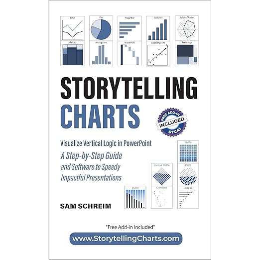
I was halfway through a long train journey when I cued this one up, and I found myself in the particular frustration of listening to a book describe things I needed to see. Storytelling Charts is, at its core, a visual medium book. Sam Schreim is teaching people how to choose the right chart type, how to structure slides using what he calls vertical logic, how to use barbell charts and MEKKO charts and waterfall diagrams to make arguments. All of this is genuinely valuable. And almost none of it benefits from being described rather than shown.
That said, I want to engage with what the book actually argues, because the underlying methodology is solid. Schreim comes from a consulting background, and it shows in the best possible way: the frameworks are practical and specific, the examples are rooted in real business communication problems, and the book does not waste time on aesthetic principles divorced from function.
The 5SUF and TVMA Frameworks in Practice
The 5-Step Universal Framework that organizes the book is worth understanding. Schreim breaks slide construction into five stages: defining the message, selecting the data that supports it, choosing the right visual format, applying design principles that serve clarity, and validating that the slide communicates what you intend. This is not a novel sequence, but the book’s specific treatment of how to move between steps is more disciplined than most presentation guides.
The TVMA formula for chart selection is where Schreim adds real value. The framework asks four questions about your data: what is the Time dimension, what is the Variable you’re comparing, what is the Measure you’re using, and what is the Audience context. Working through these questions consistently before choosing a chart type prevents the common error of selecting the visual format you know rather than the one that serves the argument. Reviewers cite this as the most practically useful element of the book, and I agree with that assessment.
Where the Audio Format Breaks Down
The book covers chart types including barbell charts, MEKKO charts, waterfall charts, waffle charts, and multiple qualitative visual frameworks. These are described rather than shown. A listener who already knows what a MEKKO chart looks like can follow the discussion. A listener encountering the term for the first time is working with pure abstraction. This is the structural limitation of the format, not the content.
Schreim mentions a free PowerPoint add-in in the synopsis. This is a print-companion resource that does not translate to audio, and it represents exactly the kind of tool-based learning the book is designed to support. The book works best as a reference you can flip through while building slides, not as something to absorb linearly while commuting. The Virtual Voice narration amplifies this problem: the synthetic delivery has no way to model the persuasive clarity that the book is trying to teach, which creates an odd disconnect between message and medium.
Listener Guidance
If you work in consulting, strategy, or any role that requires presenting data to executives or clients, the frameworks here are worth your time. Get the print version. The audio edition exists, but the book’s value is almost entirely in the visual and structural guidance that benefits from being seen. Schreim’s consulting background means the advice is grounded in actual high-stakes presentation environments rather than theoretical best practice. Reviewers like David Perrotta and Alanna Marie speak to the genuine practical shift in how they approach slides after reading it. That outcome is real. The audio path to it is unnecessarily difficult.
Frequently Asked Questions
Does the Audible edition include a PDF companion with visual examples of the chart types discussed?
The synopsis mentions a free PowerPoint add-in for building slides, but based on available information the Audible edition does not include a comprehensive visual companion. The print version of the book includes the visual examples that the audio cannot provide. If you choose the audio edition, supplementing it with the print version is strongly recommended.
What is vertical logic, and why does Schreim consider it the core principle of slide design?
Vertical logic refers to the principle that every element of a slide should flow from and support a single top-level message. The headline of the slide states the conclusion, and every visual element below it provides evidence for that conclusion. This is standard consulting communication practice and is contrasted with slides that present data and leave the audience to draw their own conclusions, which Schreim argues is the source of most presentation confusion.
Is this book relevant if I use tools other than PowerPoint, such as Tableau, Looker Studio, or Google Slides?
The frameworks, particularly 5SUF and TVMA, are tool-agnostic. The specific PowerPoint references and the free add-in are obviously platform-specific, but the principles of chart selection, message hierarchy, and visual logic apply regardless of which tool you use to build slides. Tableau and Looker users will find the chart-selection guidance relevant even though the implementation details differ.
How does this compare to Cole Nussbaumer Knaflic’s Storytelling with Data?
Both books advocate for message-driven data visualization and argue against decorative charts. Knaflic’s book is more widely cited as a foundational text and goes deeper into the cognitive science behind visual perception. Schreim’s book is more structured around a specific workflow framework and places greater emphasis on the consulting context and high-stakes executive presentations. They are complementary rather than redundant.